
An Ultimate Guide to Control Charts in Six Sigma
Introduction
A Control Chart is also known as the Shewhart chart since it was introduced by Walter A Shewhart. We can also call it as process behavior chart. By this, we can see how is the process behaving over the period of time. Although in Six Sigma study, we usually read Control chart in the Control phase. However, a control chart is being used at the initial stage to see the process behavior or to see the Voice of Process (VoP). If our process is stable its’s only then we should think about running the project. Else, at first, we should make the process stable. It is one of the seven effective quality tools.
If we say the process is stable, which means that all the data points fall under the control limits, no special reason which is making process unstable.
What is a Control Chart?
As a matter of fact, we have variations everywhere, no process is without variation. This means that there can be no common cause variation or special cause variation. In the control charts, we see how these variations impact our process over a period of time, whether our process will be in control or will cross the process boundaries. Control charts help us in visualizing this variation. Control charts have one central line or mean line (average), and then we have the Upper Control Limit (UCL) and Lower Control Limit (LCL). The upper control limit and lower control limit are three standard deviation distance from the center line in both sides. We can have the upper warning line and lower warning limit also. Now the question is which is the two standard deviation in distance from the central line? The one which alarms us if data points crossing this limit, this can make the process unstable.
You may also like: DMAIC – A Six Sigma Process Improvement Methodology
Significance & Objective of a Control Chart in Six Sigma
We use a control chart to see the special cause variation. Special cause variation does not always indicate the negative part of the process, sometimes it reflects a good indication for the process too. If we have some special cause due to that we have process variation, we can adopt the preventive actions to avoid those special cause variation in the future. Likewise, if we get late due to a flat tire, we could take some preventive actions to avoid such situations in the future. The special cause is also called as the assignable cause as it is avoidable, while the common cause is inevitable.
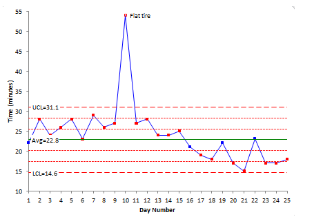
Image Source: https://www.spcforexcel.com
One of the reasons to use a control chart is to see whether our process is stable or not if we find the process as unstable, we need to work on this. It even gives the discern between the assignable or unassignable causes for variations. The control chart tends to make a process simple while skipping the assignable causes.
It helps to detect the process average, and estimate the variation (the spread in the histogram). We need to understand that the process in control is more important. Also, you need to check the process mean, and all the data points should fall between the Upper and Lower Control Limits. By doing this, we can judge whether our process is capable enough or not and also what we want to do with our process.
Where can we check the Process Capability by Cp and Cpk?
While using the control chart, we could see the process improvement, while seeing the process average and we can compare it with the earlier process mean. This gives us the information about how much our process is in control. Like as a normal chart here in control chart, we have the same rules, 68% of data points should fall under the 1st standard deviation, and 95% data points should be within the 2nd standard deviation, and 99.7 % data should be within 3rd standard deviation.
Apart from these, there are other points too. They are:
When do we need to predict the outcomes range?
How to check the stability?
When do we need to see the pattern of process variations?
When & How does quality improvement help in understanding the specific problem and preventing them?
You may also like: How to measure Process Capability and Process Performance?
How to create and use a Control Chart?
We can create a control chart while using the Minitab, we need to enter the data in Minitab and use the control chart as per data types.
If we do not have a Minitab, we can make it in Excel. In Excel, we need to enter all the data points and take out the average of data points, then find out the standard deviation with standard deviation formula. If we don’t know the use of Excel then use the online standard deviation calculator that provides the solution of standard deviation without using any formula. Simply enter the data points into the calculator, and it will compute the accurate standard deviation results. Continue this process to find up to the 3rd standard deviation, and then use these values to create a control chart.
The above example is for a simple I-MR chart, which we can make and use it for continuous data types.
When to use a Control Chart?
We can use a Control Chart, at the starting of a project or whenever we want to see the VoP. While seeing the VoP we can even find the reason for running the project.
We can see process improvement too by using a Control Chart towards the end of the project. This would also help in determining whether the project is successful or not.
A Control Chart also helps in checking the process stability and verifying whether the process is stable enough to improve and make necessary improvements in the process wherever required.
Four Process States in a Control Chart
The 4 process states in a Control Chart are discussed below:
The Ideal state: This is where the process is in control and all the data points fall under the control limits. There is no non-conformance.
The Threshold state: Although data points are in control, or the process is stable, however, some non-conformance happen over a period of time.
The Brink of Chaos state: In this, the process is in control; however, it is on the edge of committing errors.
And the fourth stage is when the process is Out of Control and we have unpredictable non-conformance.
You may also like: Process Maps: What are its Different Types and their Application?
Types of Control Charts
Control Charts are basically of 7 types, as it all depends upon the data type. If we have a continuous data type, then we can use 3 types of Control Charts i.e. I-MR Chart, X Bar R Chart, and X Bar S Chart.
If we have a discrete data type, then we use the 4 types of Control Charts: P, Np, C, and U Charts. All these types are described as below:
I – MR Chart
We use the I-MR charts when we cannot do the subgrouping of the data, due to not much data points, or maybe the product takes long cycle time to produce, then we can use the I-MR chart, which means Individual Moving Range Chart. Here, at first we see the data points in the Control Chart and then their difference in the chart.
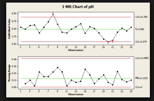
Image Source: https://leansixsigma.community
X-Bar R Chart
When we have 2 or more than 2 subgroup size then, this is being used for continuous data. The standard chart for variables data, X-bar and R charts help to determine if a process is stable and predictable. In the X bar chart, X indicates the mean of all the subgroups in the chart, whereas R indicates the range of all subgroups in the chart.
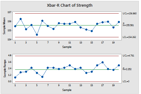
Image Source: https://sixsigmastudyguide.com
X Bar S Chart
In the X Bar S chart, we use it to check the mean of the subgroups and the variation of the process. It is being used for more than 2 subgroups size and can also be used for more than 10 subgroups.
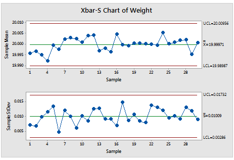
Image Source: https://support.minitab.com
The above-mentioned charts are being used for continuous data. Let’s now move on to discrete data. For discrete data, we have 4 types of charts, since discrete data is segregated into two parts, (i) defects and (ii) defective and it varies depending upon the constant subgroup size.
You may also like: Demystifying the difference between Lead Time, Takt Time and Cycle Time
P and Np Control Charts
The P and Np charts are used for defective data to check the process stability while seeing the defective data points. The main difference between the P and Np is P chart is used when sample size varies, whereas Np chart is used when the sample is constant.
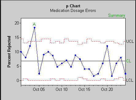
Image Source: http://www.statit.com
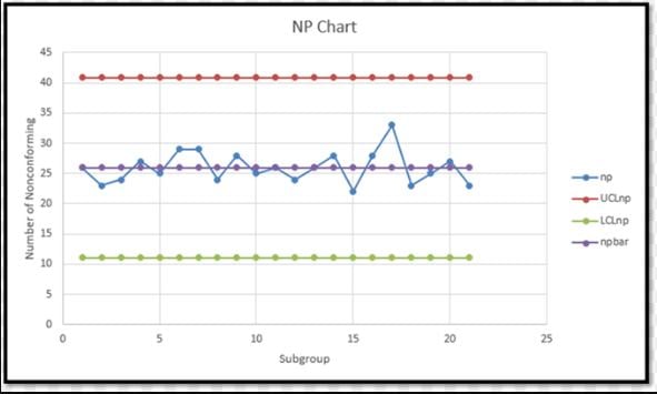
Image Source: http://myweb.wit.edu/
C and U Control Charts
The C and U charts help to check the stability in a single unit, which might have more than one defect. For example, the number of defects in one pen. Here also, we can see the defects on the same size of the sample or it can vary on other samples.
C Control Chart is used when there is more than one defect and the sample size is fixed. While U Control Chart is used for more than one defect and if the sample size is not fixed.
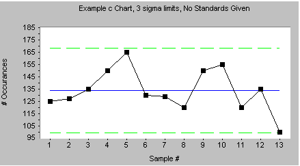
Image Source: http://www.skymark.com/resources/tools/control_charts.asp
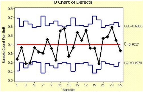
Image Source: http://www.six-sigma-material.com/U-Chart.html
Selection of the right Control Chart
The selection of a right Control Chart depends upon the data types; what type of data we are going to use, what is our subgroup or sample size, etc. So what information do we need to check with the Control Charts? These charts can be selected or made by on the basis of the below mentioned charts:
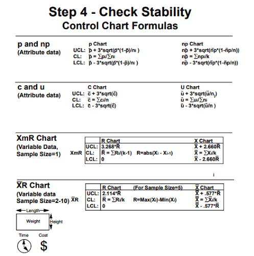
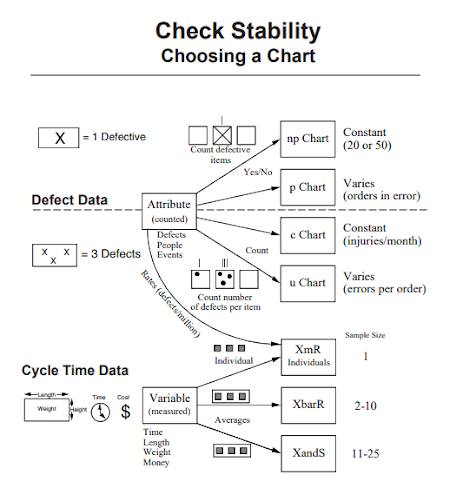
Images Credit: The Design for Six Sigma Memory Jogger - Dana Ginn & Evelyn Varner
How & Why a Control Chart is used as a Tool for Analysis?
A Control Chart is used to monitor, control and improve the process performance over time by studying the variation and its sources.
Control Charts are used to focus on detecting and monitoring the process variation over time. It helps us to keep an eye on the pattern over a period of time - variation, quantity, the current capability of your process and identify when some special events interrupt the normal operations. In the Improve phase, Control Charts are used to see the process improvement.
Since Control Charts and Run Charts show on-time passes, and reflect the improvement in the process while running the project. They are considered one of the best tools for analysis.
It monitors the progress and helps to learn continuously and quantify the capability of the process and evaluate the special causes happening in the process. It is typically part of the process management chart.
It is also used to segregate the difference between the common causes and special causes. We have already discussed in detail how and what control chart should we use. Given below are a few tips which we can be useful while using Control Charts.
You may also like: A Complete Guide to a Lean Six Sigma tool: SIPOC
Few tips and points to consider while using for Control Charts
If LCL is negative, we can assume LCL as 0, instead of a negative value.
And for P and U chart, we know they vary with their sample sizes, for that we can take the average of their sample size to fix the sample size.
As we can see for continuous data, Control Charts exhibit two different charts, whereas for discrete data we can make a single Control Chart.
If the process is in control, which doesn’t mean that the product is meeting the expectations, it just means that it is consistent in performance.
Also, don’t get confused by control limits and specification limits. Specifications limits are given by the customer, whereas UCL and LCL are considered as the process variation limits.
Although the points which are on the outside of control limits indicate the special cause. The points which are on the inside of the limits give the indication that the data points are showing some trends, shifts, or sometimes instability.
For instance, if we remove the special cause, at that time we should not recalculate the control limits. For as long as the process is not changing, we should not change the process limits.
Benefits of using Control Charts and Who can benefit from its use?
The Statistical Process Control(SPC) helps in reduction of the margin of errors since it is a kind of early warning system, which gives you an alarm for your process that in near future the process would go out of control if no preventive action is taken.
It also shows in what is the condition of the process whether it is under control or not and what circumstances make it out of control. Accordingly, we can take the action and avoid any chaos in the process.
Conclusion
To conclude we may say that a Control Chart is a boon for process improvement and helps to take the necessary preventive action for causes which can lead to the process going out of control. In this article, we have discussed the different types of Control Charts and their usages in the real world.
As a matter of fact, a Control chart should be used in some time interval to see the process performance, as it is like a health check-up of your process. In a Six Sigma project, we can use a Control Chart at the starting of the project as well as at the Improve phase to implement some necessary improvement steps and adopt some corrective measures to keep the project under control.
Stabilize your process | Sign up for a Six Sigma course now!