Run Charts: What Good Are They?
Well, lots of things, of course!
Many people consider run charts as a useful tool in any quality improvement program. Run charts are graphical depictions of data plotted over time.
When you collect and display data over time, you may view trends and patterns in a process. Run charts allow a team to observe collected data over that period. I find them very helpful at the starting phase(s) of a project.
In DMAIC projects, I often use them in the measure phase to gain insight on how a process is running. If you collect a benchmark for your process, run charts let you test changes. It’ll show you if the changes result in improvement.
Within a project’s duration, you can track measurements to gauge if your company is sustaining these improvements and give you an understanding of the process capability.
Benefits of a Run Chart
One of the most significant benefits of a run chart is its help in the early detection of changes in a process. A run chart signals improvements or degradation in how a process performs over time. And this happens without any complicated math equations.
I find run charts helpful because analytical skills associated with quality improvement project teams can vary. We don’t calculate control limits on a run chart; this means your data tables contain one or two points to display.
Here are some benefits to consider. Run charts have important uses in activities that focus on process improvement.
- To display collected data to make it easy to visualize
- If you make any changes or install any improvements, a run chart can show the results of these improvements
- In viewing the data over time, run charts allow a temporal versus a static view of a process
- Run charts give guidance as you continue with improvement projects. They can highlight any increase in value that may occur from improvements
- Run charts help to determine when changes are actually improvements. They do this by displaying the collected data in a pattern that you can observe as you put changes in place.
- Within the Control phase of DMAIC, run charts determine if you are holding gains made by improvement projects
The process uses an IMR (Individual Moving Range) chart, also called a Process Behavior Chart, where you add your upper and lower control limits. Albeit, these charts are beyond the scope of this article.
Run charts have important uses in activities that focus on process improvement.
When to Use a Run Chart
Why should an organization or team use a run chart? When might you find a run chart to be helpful?
Improvement in a process, or an organization, takes time. So, you must be sure that improvements are happening to access the effectiveness of the changes. Thus, you need to observe the output data from a process over time.
With all this in mind, using a run chart as a part of your control plan is also conceivable.
A run chart will display systematic patterns in data, known as a signal, versus a noise. In measuring a process, the signal is the information that you’re trying to detect. On the other hand, noise is an unwanted variation that can take focus away from the signal.
Where do you fit a Run Chart in your Improvement project?
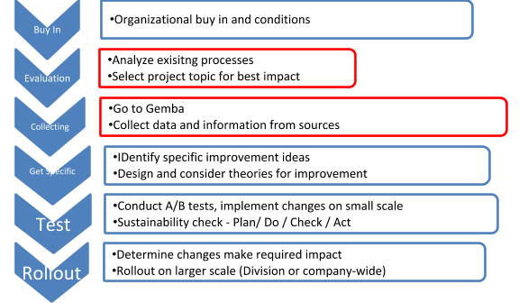
Understanding that not all teams may follow a DMAIC model, I’ll give you a high-level picture of where a run chart may fit in your pilgrimage of improvement. To best do this, here is an image that encompasses aspects of an improvement process. The red ones show areas that run charts can assist.
How can you make the best use of run charts? Here are some best practices to optimize run charts for high-level analysis.
• You are most likely looking for trends and detailed values will clutter your chart.
• If your chart populates and it looks like a straight line, try zooming-in some. You may need to change the scale some to look at any changes or trends.
• If attainable, I recommend using 12 to 15 data points, but no more than 15. This is a good amount of data and is sure your time variable (Y-axis) reflects a more condensed time frame
Components of a Run Chart
A run chart has several parts. Depending on the depth of analysis and display, a chart may contain 5 or 7 parts. Are all the parts equally important? No. But put together they help demonstrate a clearer picture than information separately displayed. Here are the parts of a run chart.
Parts one through five, I consider to be typical and included on every chart. Parts six and seven tend to be displayed depending on the project team and detail needed in a project or presentation.
- The Title: It briefly describes the information being displayed on the chart.
- Vertical Axis (Y-Axis): This axis is a range that demonstrates the significance of the dimensions represented by data collected
- Horizontal (X-Axis): This shows you the time table when the data was collected. This axis will display the progression in which the events being measured take place
- Data Points (along with the chart): Each point simply represents an individual measurement
- Legend: The legend tells what each line represents. Additional information that documents the data collection should also be here.
- Median Value (also called the Centerline): significant if it shows a large number of consecutive values above or below, denotes something to investigate – not random variations in a process
- Data Table: This is a listing of the data being shown in the chart.
Interpreting a Run Chart
Here are a few things I look for in a run chart presented to me, or when I'm creating one myself :
Outliers in your chart:
Look for data points that are unusually smaller or larger than other data points on the chart. This is a subjective observation but if you feel any person observing this chart would consider it out of a normal range, then consider this point an outlier.
Trends in your chart:
Trends are defined as a large number (6 or more) of consecutive points all going in the same direction – either up or down. Please note that data points should be increasing or decreasing with each increment. If you have two points that are the same, do not count them in your measurement of a trend.
Shifts in your chart:
A shift is considered to be six or more consecutive data points that are collected on the same side of the median. These points can be either all above or all below the median. Data points that fall on the median should not be considered as they do not count toward or against creating a shift. You will ignore these points that fall on the median and continue counting.
Runs in your Chart (I also refer to these simply as cross-overs):
A run consists of a number of points, in a row, which occurs on just one side of the median. Under typical circumstances, there should be points crossing the median regularly. If they do not cross, something else may be influencing the data. Data points tend to move above and below the median at regular intervals. If some points fall right on the median line, it can make it difficult to decide if they belong to a run.
Constructing a run chart in Microsoft Excel
Making a run chart is quite simple and can be done by using the default tools provided in Excel. There are charts you can also make using statistical software but I find many organizations do not have these tools available. Since you are not using any control limits on a run chart, use Excel options. You get the same display using the graphical tools in Excel.
Align your data in 2 columns in a new Excel sheet. Label the name of the sheet at the bottom. Label your columns with A column for the time shown and B-column is your measurement. (Hint: If your data wraps around from one year to the next, make sure you go back and confirm that data for say November and December have the correct year. I think the default for Excel is to put in the current year).
For purposes of analysis, determine the Median measurement for your data. To do this click on a blank cell below your data. The formula you use is =Median(input cell range) – for the purposes of my graph, I used formula D2:D15. You see in the example below that my Median was 13.9% shown in cell B19.
Now populate Column E (E2 to E15) with the Median amount.
Time to create your chart
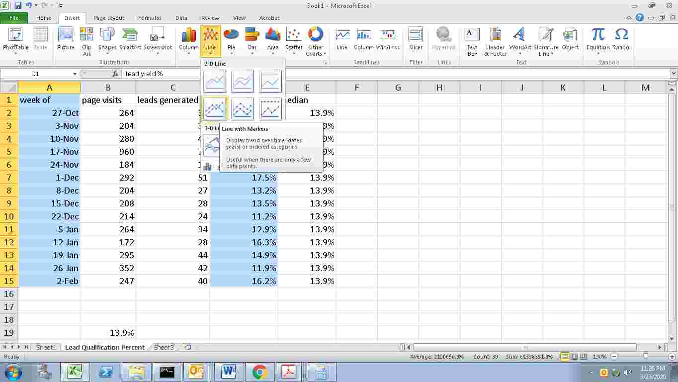
Using your mouse, highlight the data you want to analyze. In this case, I am going to highlight columns A and D. Then go to the top and find “Insert.” The thread trail you follow is Insert>Line>Line with Markers.
This Chart type is often found in the default set up on the line dropdown, but if not, you can find it in the “All Chart Types” selection and hit enter (see picture below).
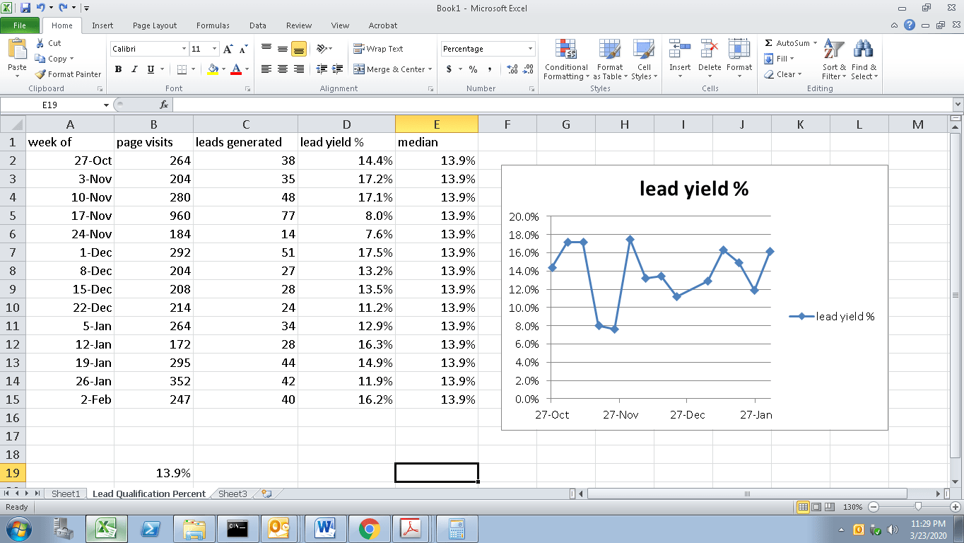
Your Run Chart Appears:
You can choose from a variety of formatting features to set up the chart as you want. You want to double click on the chart, then use the functions in Excel to format your chart.
Here are some basic ideas on how to format the run chart.
- Remove gridlines
- Take off the legend on the right side
- Format more whitespace
- Add a more detailed title and create an infographic
Now create the median line using the data we already generated on the sheet.
The following will depict the steps to create the median line:
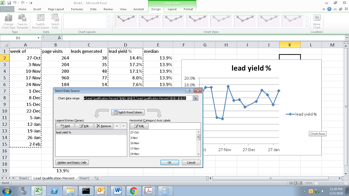
Using your mouse, right-click on the chart. A menu will appear. Choose “Select Data,” and the data input field below will pop up.

Select “Add.” Then a smaller field will come up for you to specify what data to add. Highlight with your mouse like below and click “OK.”
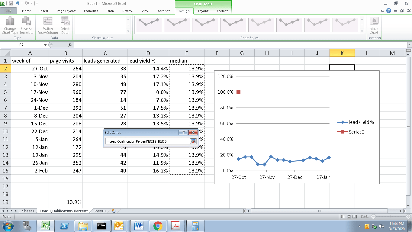
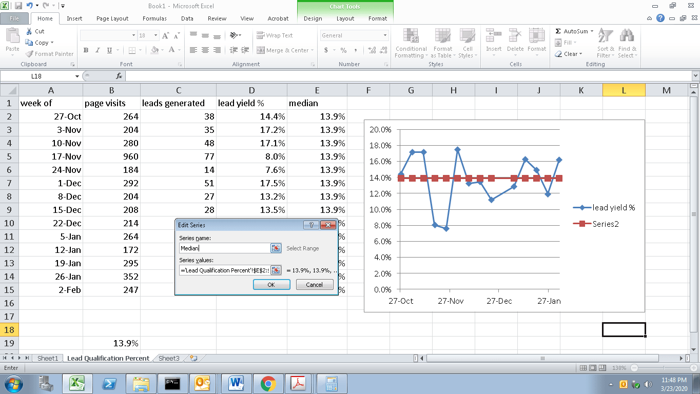
The Smaller field will return, and you click on the top blank box and type in the median to name this new data to be displayed. Click OK twice, and the median line populates for visual effect.
Become a certified Quality Management Professional.